
A brand built on one idea: the contrast between hot and cold, carried through every part of the system.
A brand identity built on a single idea: the contrast between hot and cold. Every part of the system, from the logo to the photography, plays on that push and pull.
A brand built on one idea: the contrast between hot and cold, carried through every part of the system.
SubZero pairs cold plunge and hot sauna, contrast therapy that lives entirely in the tension between freezing and burning. The brand needed to capture both extremes at once and feel modern, energetic, and premium without picking a side.
The heart of the identity is a temperature gradient that runs warm orange to cool blue, cutting straight through the SubZero wordmark like a line on a thermometer. That single device carries the whole hot-and-cold story, and it scales down to a thermometer icon and a compact mark for small applications.
A warm-to-cool palette and a clean, technical typeface round out the system, giving SubZero a look that feels like performance and recovery rather than a traditional spa.




To dramatize the two halves of the experience, I masked photography directly inside oversized type, warm sauna imagery inside SAUNA and icy plunge imagery inside COLD, so the words don't just name the sensation, they show it.

The mark was built to sit over the brand's photography, cool blue plunge scenes and warm sauna interiors alike, holding steady across every mood the experience moves through, plus a full set of solid-color lockups for flexible use.
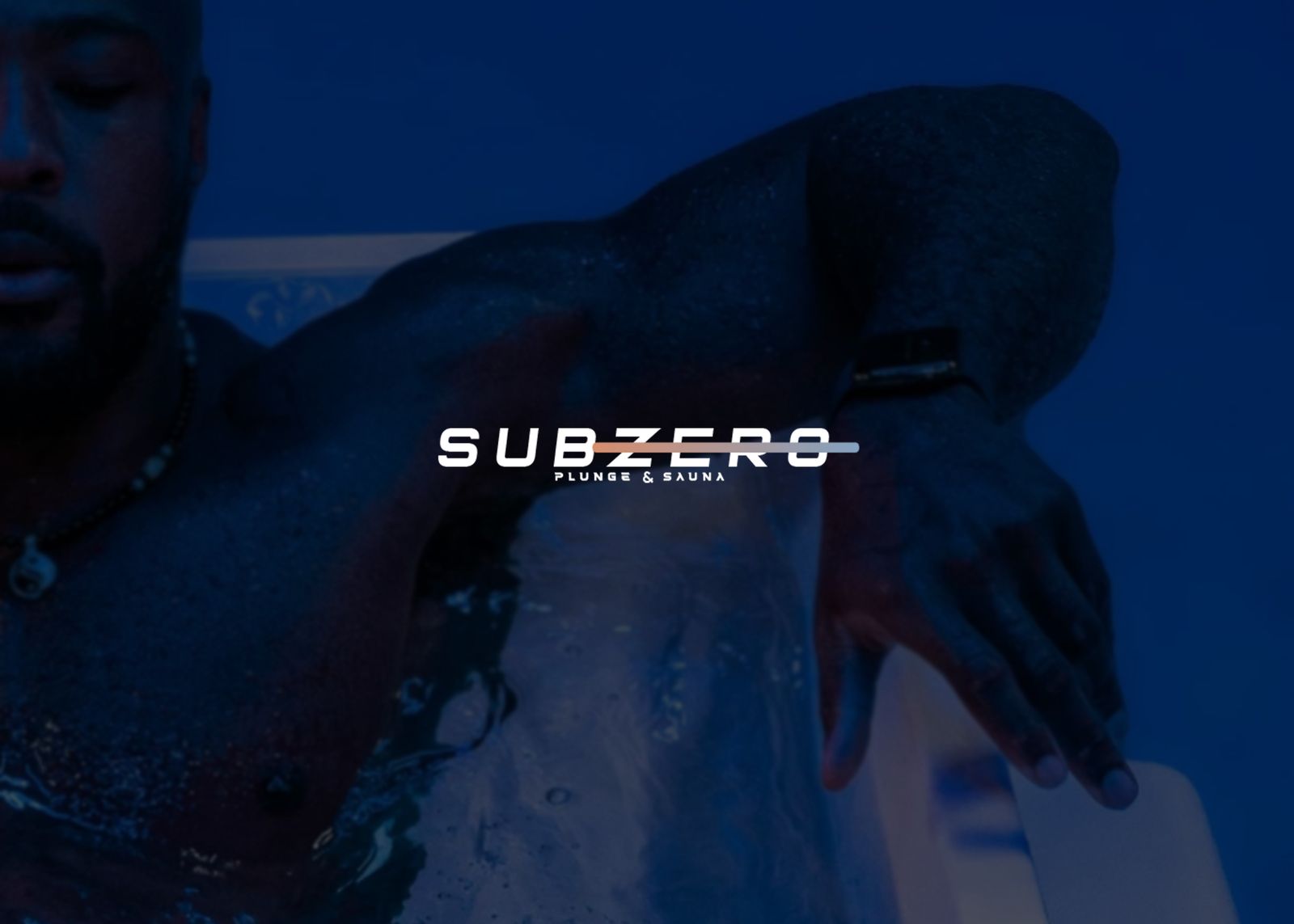

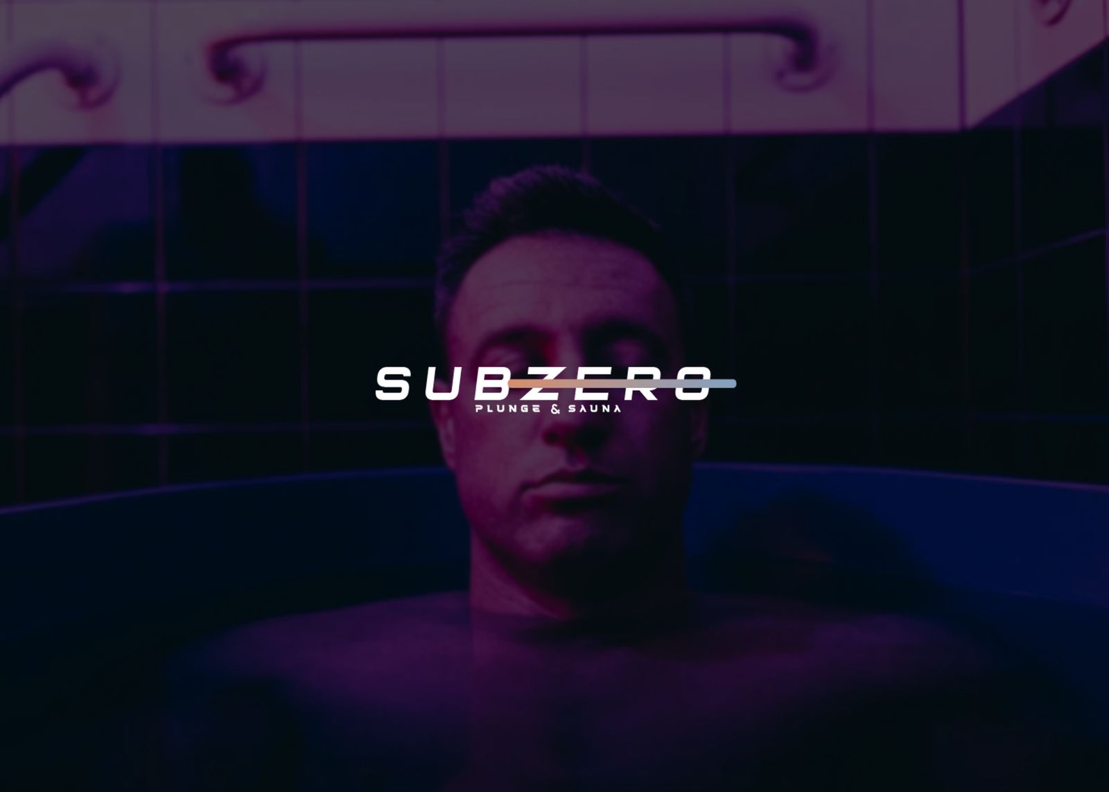
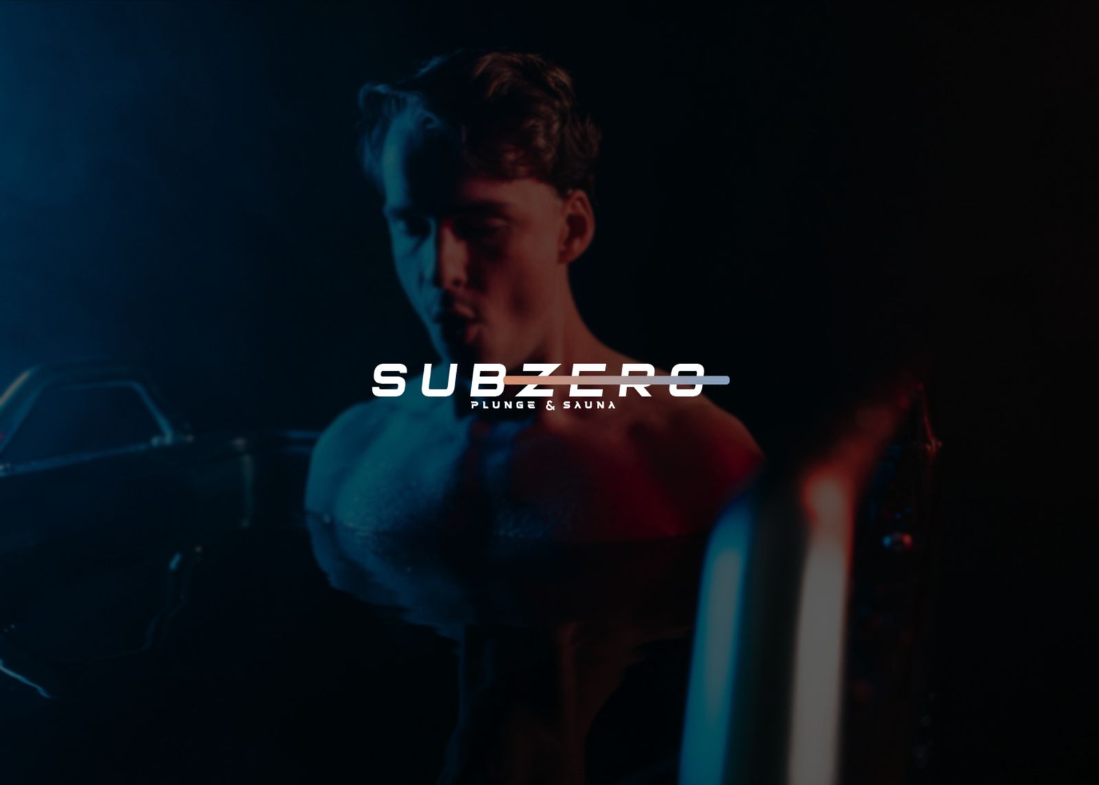


The finished system gave SubZero a distinctive hot-and-cold identity that works across signage, social, and photography, built from the ground up to stand out in a growing wellness market.